While Google has yet to announce a firm launch date for its AI-enhanced Assistant with Bard, the Google app has been updated with some new designs, including our best look yet at its popup window and an interesting tab switcher. The company is also tweaking its recently launched stocks and finance widget.
About APK Insight: In this “APK Insight” post, we’ve decompiled the latest version of an application that Google uploaded to the Play Store. When we decompile these files (called APKs, in the case of Android apps), we’re able to see various lines of code within that hint at possible future features. Keep in mind that Google may or may not ever ship these features, and our interpretation of what they are may be imperfect. We’ll try to enable those that are closer to being finished, however, to show you how they’ll look in the case that they do ship. With that in mind, read on.
From what Google has shown thus far, it seems that Assistant with Bard is designed to fully replace the existing Assistant experience on supported Android devices. Predictably, that means you can access the AI in the same ways you’d normally invoke the Assistant, such as by long-pressing the Power button or saying “Hey Google.”
It seems the company is also planning to prominently place the Assistant with Bard experience on the Discover page of the Google Search app. As shown below, we’ve enabled what appears to be a way to quickly switch between performing a normal Google Search and getting help from AI. The new button is reminiscent of a physical slider switch and sits at the top of the page, above the Google logo, rather than as part of the existing bottom bar.
For now, it’s not clear whether this is intended to be a permanent fixture of the Discover tab. Alternatively, this switch may serve as a temporary reminder to check out Assistant with Bard if you haven’t already.
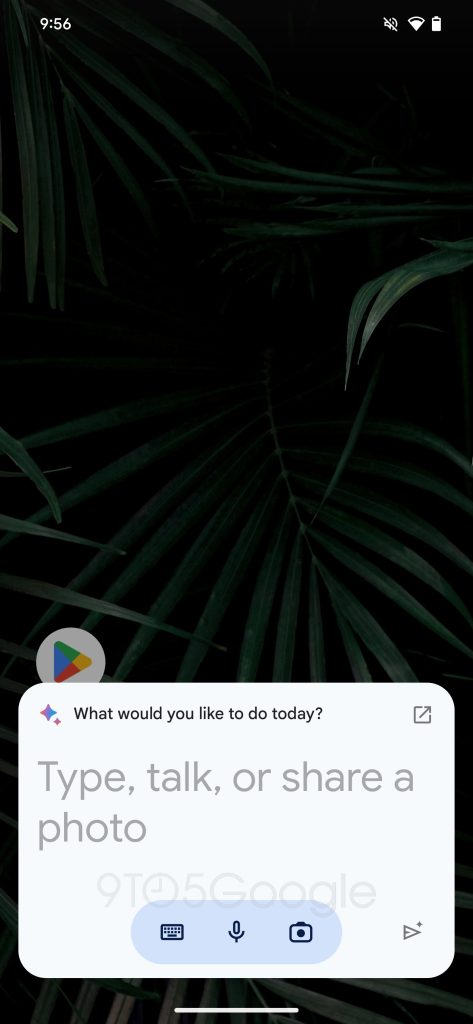
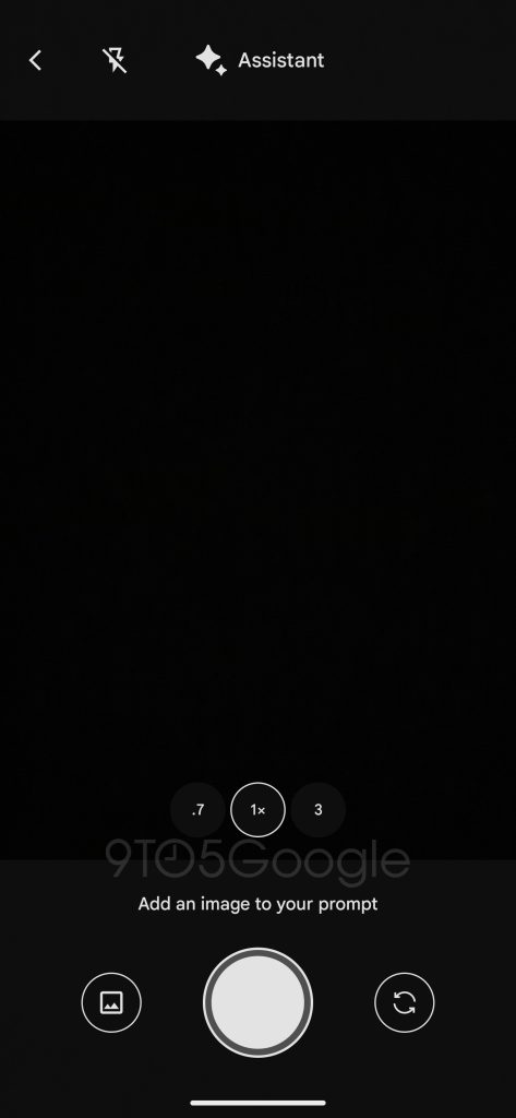
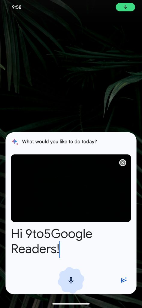
Meanwhile, as also seen above, Dylan Roussel managed to enable the actual popup window that you’ll use to submit new prompts/questions to Assistant with Bard. We first saw this design in Google’s initial previews of its AI tool at the Pixel 8 event in October. Using the three buttons along the bottom, you can type or speak a message and/or share a photo with the Assistant.
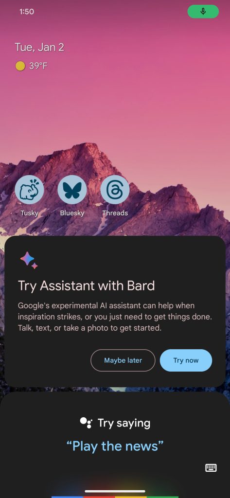
New Bard setup prompt
In other Bard-related finds, Google Search is also preparing a more prominent message encouraging you to upgrade your Assistant to include Bard AI features. Appearing above the typical Assistant sheet, a new popup suggests a few ways that AI can come in handy and offers a “Try now” button.
Google’s experimental AI assistant can help when inspiration strikes, or you just need to get things done. Talk, text, or take a photo to get started.
For now, Assistant with Bard is still inaccessible, but these design polishes show that the formal launch is growing ever closer.
Elsewhere, it seems that the Google app’s “Finance Watchlist” widget, first launched in July, will be getting some design adjustments of its own.
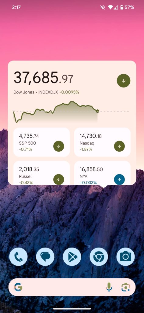
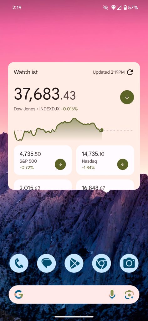
Before vs. after
Where the current iteration focuses on clean visuals, primarily showing one particular stock’s current price and recent movement, the new widget adds a bit more utility. In the top-right corner, you’ll find an indicator of when the widget last refreshed its financial data.
Next to this, the widget also moves its refresh button to a more convenient location, easily allowing up-to-the-minute information. Previously, the refresh button was tucked away at the bottom of the widget (usually requiring you to scroll down). Less helpfully, a “Watchlist” title has also been added.
Thanks to JEB Decompiler, from which some APK Insight teardowns benefit.
Dylan Roussel contributed to this article.
FTC: We use income earning auto affiliate links. More.


