Google Bard can turn data from a table into a chart, which is one example of using the power of AI for simple data visualization.
Google recently updated Bard, an experimental large language model chatbot, to add the ability to create charts. With a few prompts, you may use Bard not only to gather data but also to display it in a chart; this can be useful for research and learning, such as when you want to understand market share, visualize financial data or compare pricing.
To get started, sign in to Bard with your personal Google account, then experiment with variations on the sequences below. Make sure to follow any guidelines and policies that apply when you use any AI tool in an organizational setting.
Jump to:
Option 1: Prompt Bard for a table, then a chart
Most often, you’ll want to go through a two-phase process to make a chart with Bard: Create a table and then create a chart.
In your initial prompt, detail the data you seek and make sure to specify you want the information in a table. For example, try a prompt such as:
What are the largest 7 laptop makers in the U.S. by market share?
Sometimes this might return a numbered list of the manufacturers (Figure A). If it doesn’t include a table, you might follow up with:
Put that information in a table.
Figure A
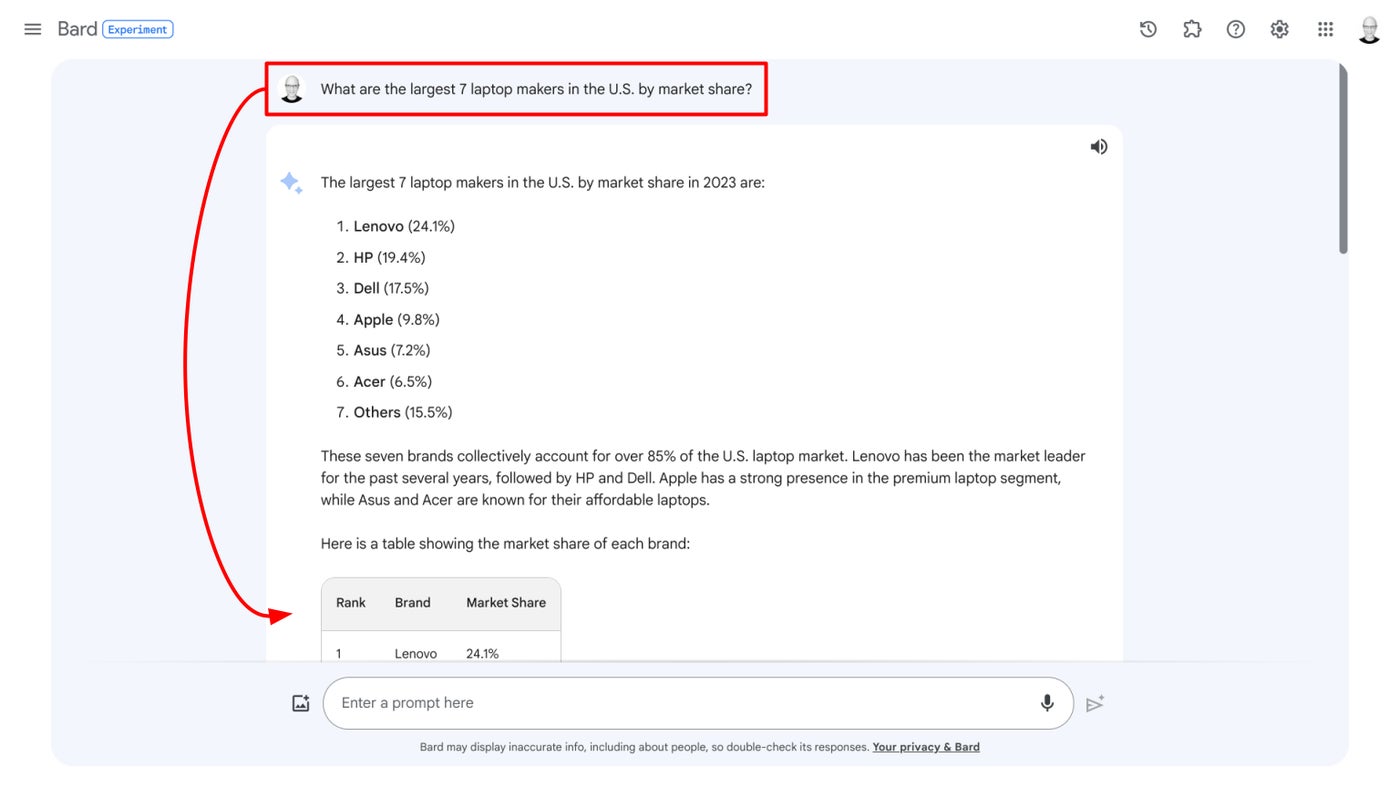 Enter a Bard prompt that produces a table, such as the table that contains laptop manufacturer data here. Image: Andy Wolber/TechRepublic
This sequence returns a list of seven laptop maker company names in one column, with market share in a different column. Now, prompt Bard to:
Create a chart.
In this case, Bard generates a pie chart and a title for the chart (Figure B). You may also ask for a specific type of chart, such as a bar chart or line graph.
Figure B
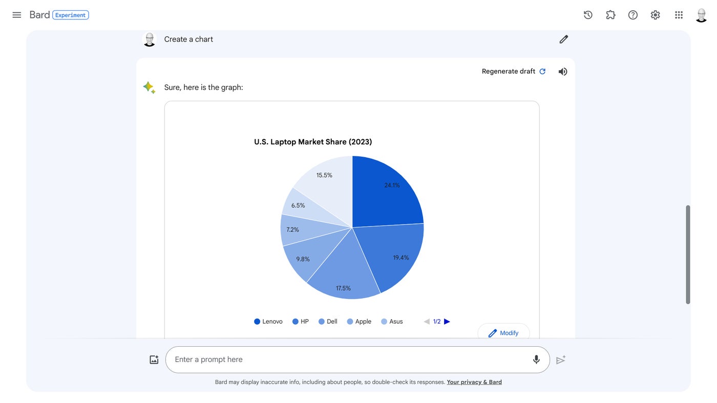 After you have elicited a table from Bard, prompt the system to “Create a chart” as shown here. Image: Andy Wolber/TechRepublic
Option 2: Prompt Bard with data for a chart
Bard can create a chart with data you provide. For example, suppose you have a set of cells in a Google Sheet that contain your data (Figure C). Select the cells within the Sheet that contain the labels and data for your chart, as you typically would for any type of copy operation.
Figure C
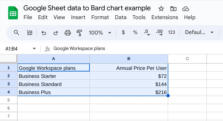 You also may copy data in Google Sheet cells to use in a Bard prompt. Image: Andy Wolber/TechRepublic
Next, start a prompt with something such as “Create a chart from this data:” and paste the copied Sheets cell contents into the prompt (Figure D).
Figure D
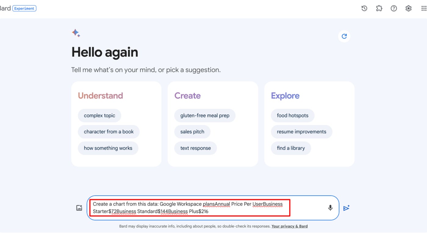 Begin a prompt that asks for a chart, then paste your data. Add spaces and commas to separate each entry. Image: Andy Wolber/TechRepublic
Edit the entry to ensure the data labels and values are appropriately separated by spaces and commas, then submit the prompt. Bard should generate a chart and a chart title from the data you provided (Figure E).
Figure E
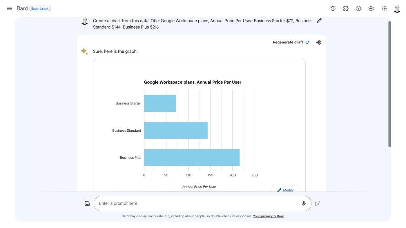 Bard can generate a chart from supplied data. Note how the sample prompt was edited to clean up the Google Sheets source data content. Image: Andy Wolber/TechRepublic
How to regenerate or modify a Bard chart
If you’re not satisfied with the chart Bard builds, you have two options: Regenerate Draft or Modify.
Select the Regenerate Draft option in the upper-right region of the response area, and Bard will take another attempt to generate a response to your prompt. Sometimes this produces the same chart as the initial response; other times, it displays the data in a different type of chart, such as a bar graph instead of a pie chart.
Figure F
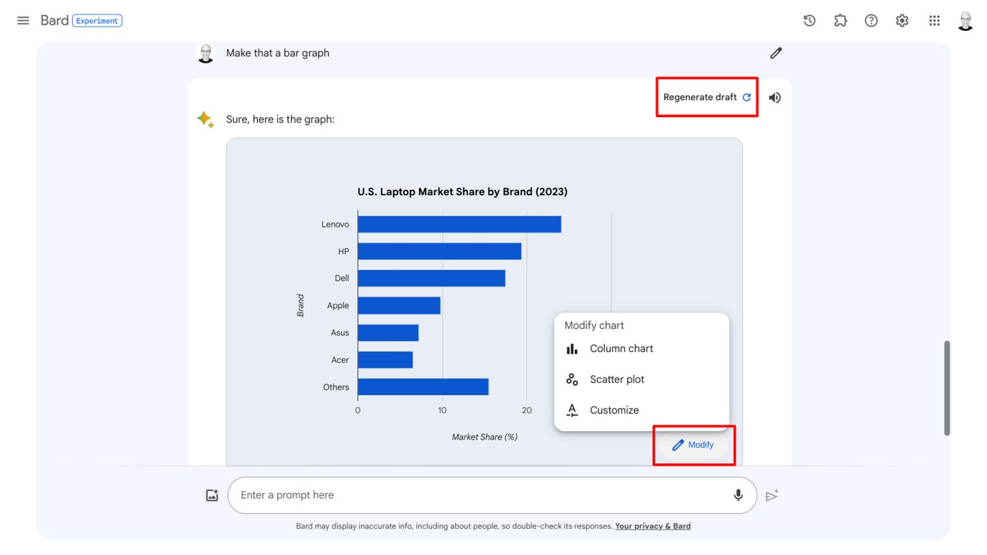 To change the chart, select either Regenerate Draft (upper right) or access the Modify menu (lower right). Image: Andy Wolber/TechRepublic
Select the Modify button in the lower-right region of the response area to access alternatives, which may vary based on your table and the current chart. For example, in one pie chart Bard created, the Modify menu lets you choose from two other chart types, Column Chart or Scatter Plot, or a Customize option; sometimes, Bar Chart and Line Chart options also may appear.
How to save and share a Bard chart
Take a screenshot of your Bard-created chart, save it and then share that image as you might any other image. The Share options won’t yet let you share a chart, so a screenshot is the best way to capture and convey chart content.
Bard charts not working? Try a different Google account
When you ask for a chart but Bard only displays code or charts found on the internet, switch to a personal Google account (instead of an organizational account) with access to Bard and give it another try. For example, Bard chart features fail to function for me when signed in with my Google Workspace Enterprise Standard account (which has both Duet AI and the Advanced Protection Program enabled), but work as described when signed in with a free Google account.


